Primary Bed & Bath Renovation
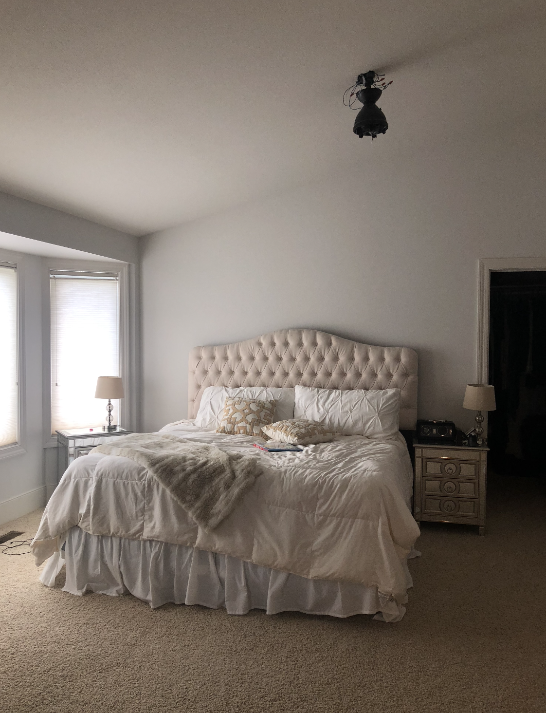
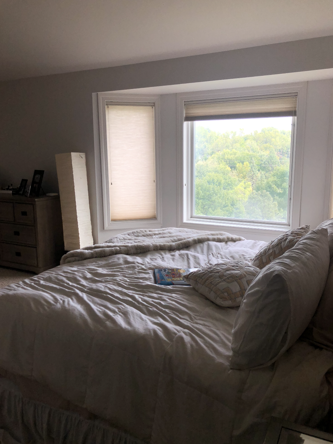
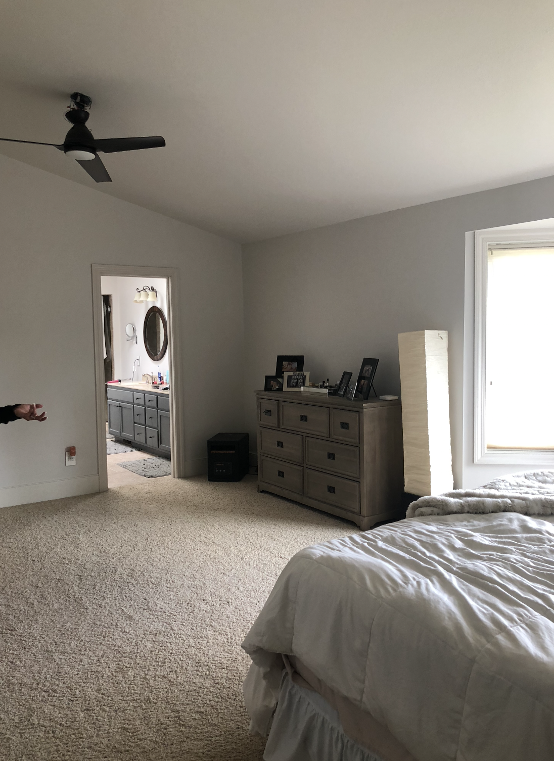
It was time for an upgrade for this blah bed/bathroom combo.
My clients primary bedroom and bathroom was just missing that “thing”. It was blah and boring and they were craving more. The couple things going for them was the amount of space they had in their bedroom as well as it being a blank canvas! These two things are a great combo when starting out a renovation!
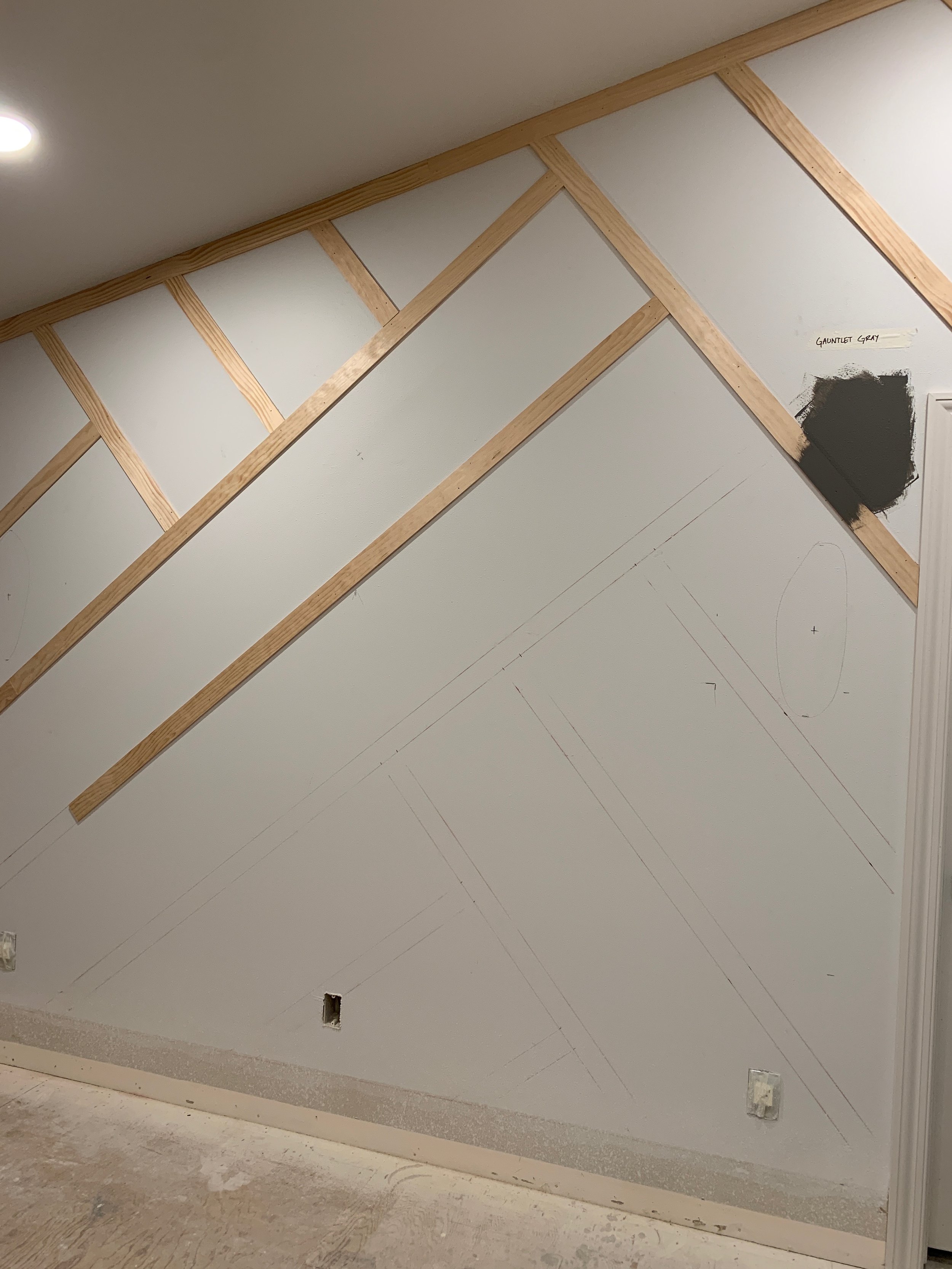
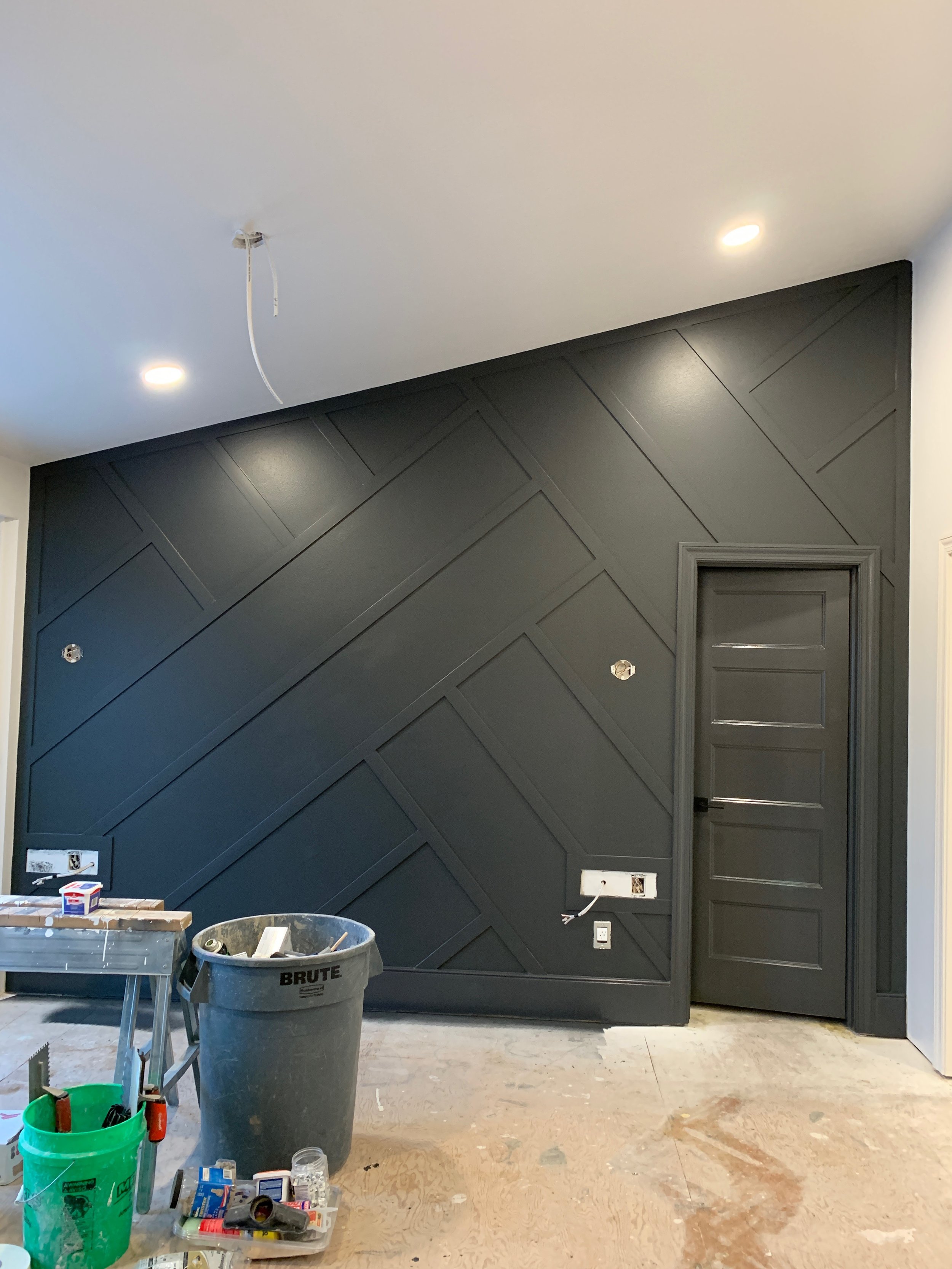
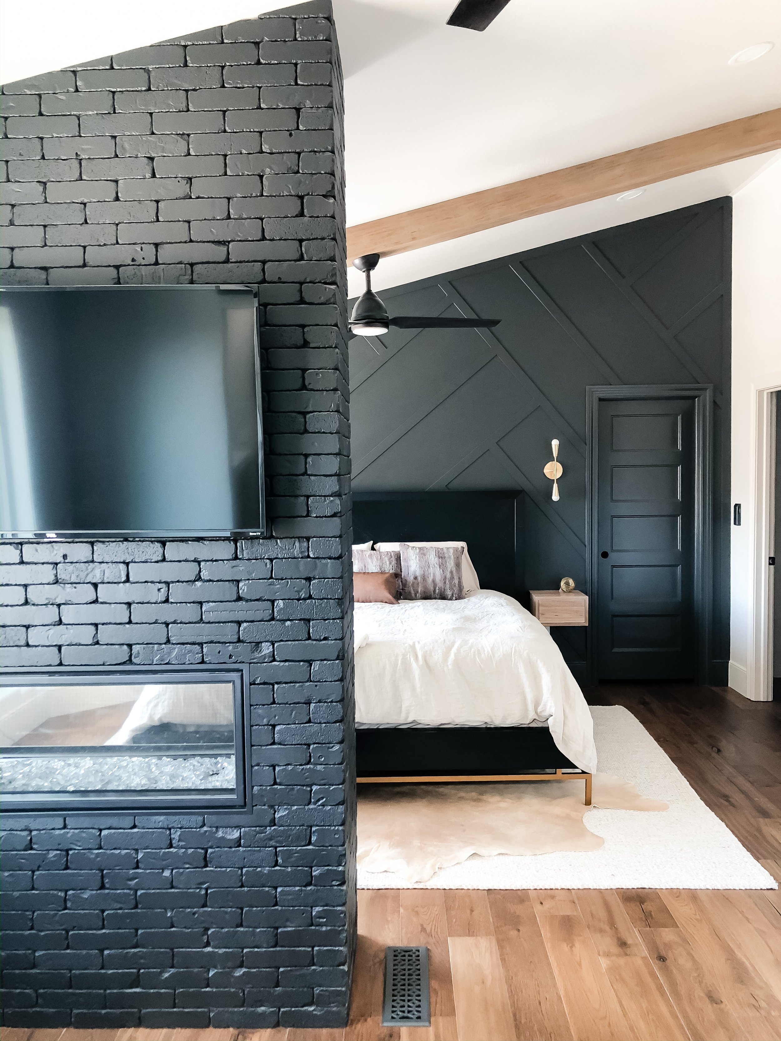
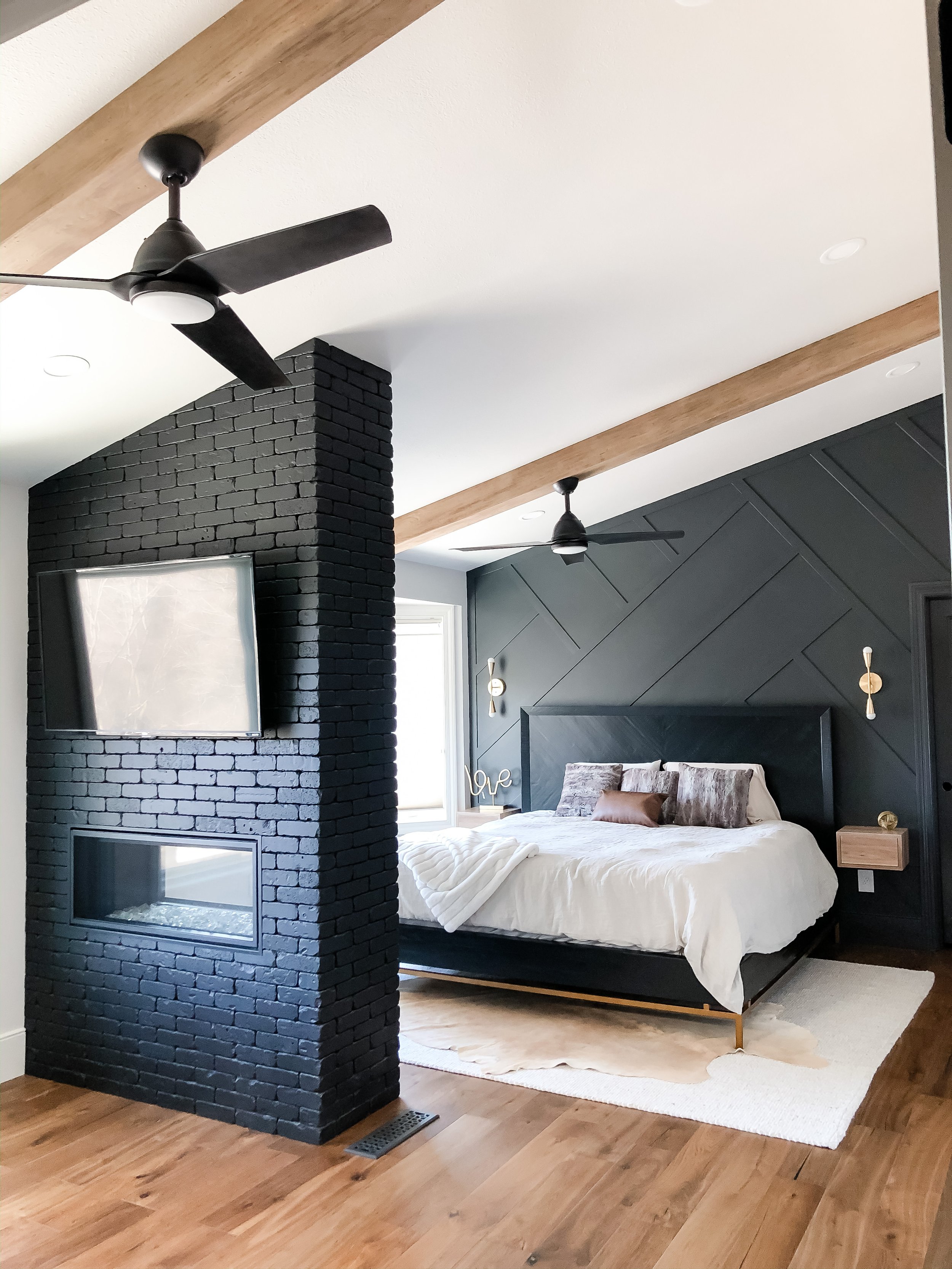
One design detail they knew they wanted was a moody accent wall behind their bed. We searched pictures and planned out the design.
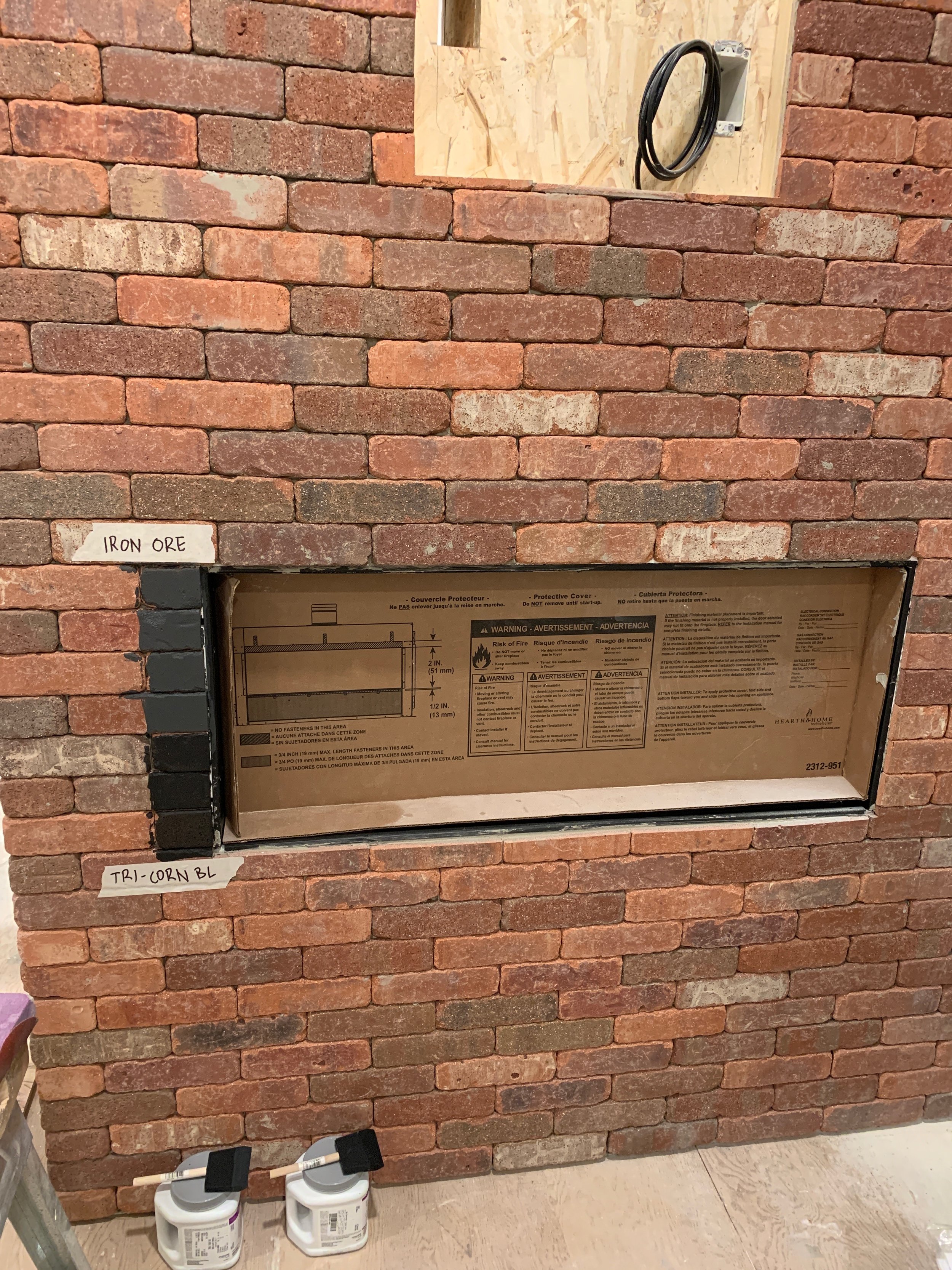
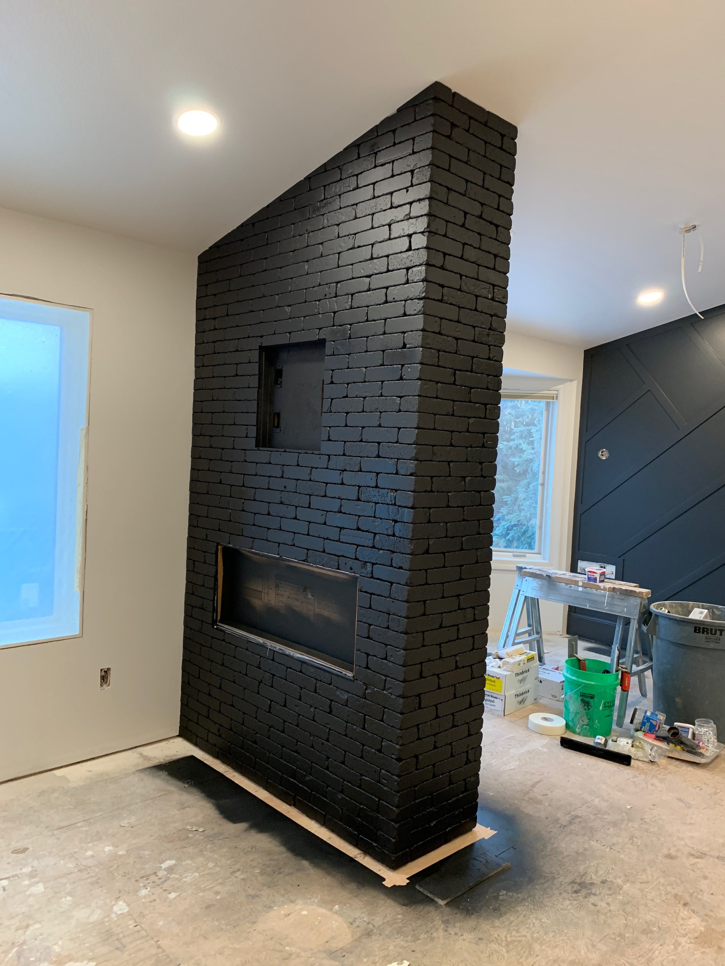
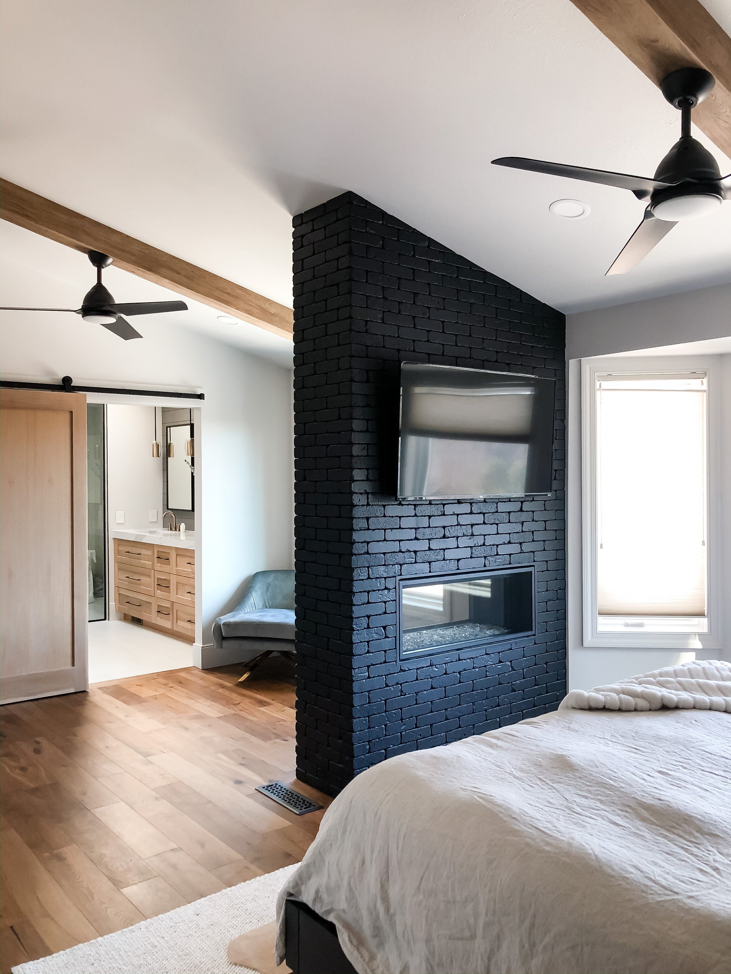
Another hope was to add a fireplace. Since their room was a longer space they definitely had the space so we decided to add in a double fireplace with TV’s above to see from the bathtub and while laying in bed. We went with thing brick here and planned to paint it. Thin brick is essentially brick but just the front half of a full piece of brick. A big pro to thin brick is the weight. This is much lighter so for this project it was perfect! Thin brick also can be less expensive than regular brick.
The flooring for their bedroom was an easy decision. They already had wood floors in the hallway outside of the room, so we were able to find the same wood floors to flow into their bedroom. While the construction was continuing, the homeowners and I started preparing to order furniture and how they’d use the space more efficiently. Since there was little space on either side of the bed for nightstands, we went with custom floating shelves to serve as a nightstand. This keeps the floor clear and looking more open. We also added beams on the ceiling for more texture and detail. I love how those turned out, and they are faux beams! They are made of foam! Can you believe it?
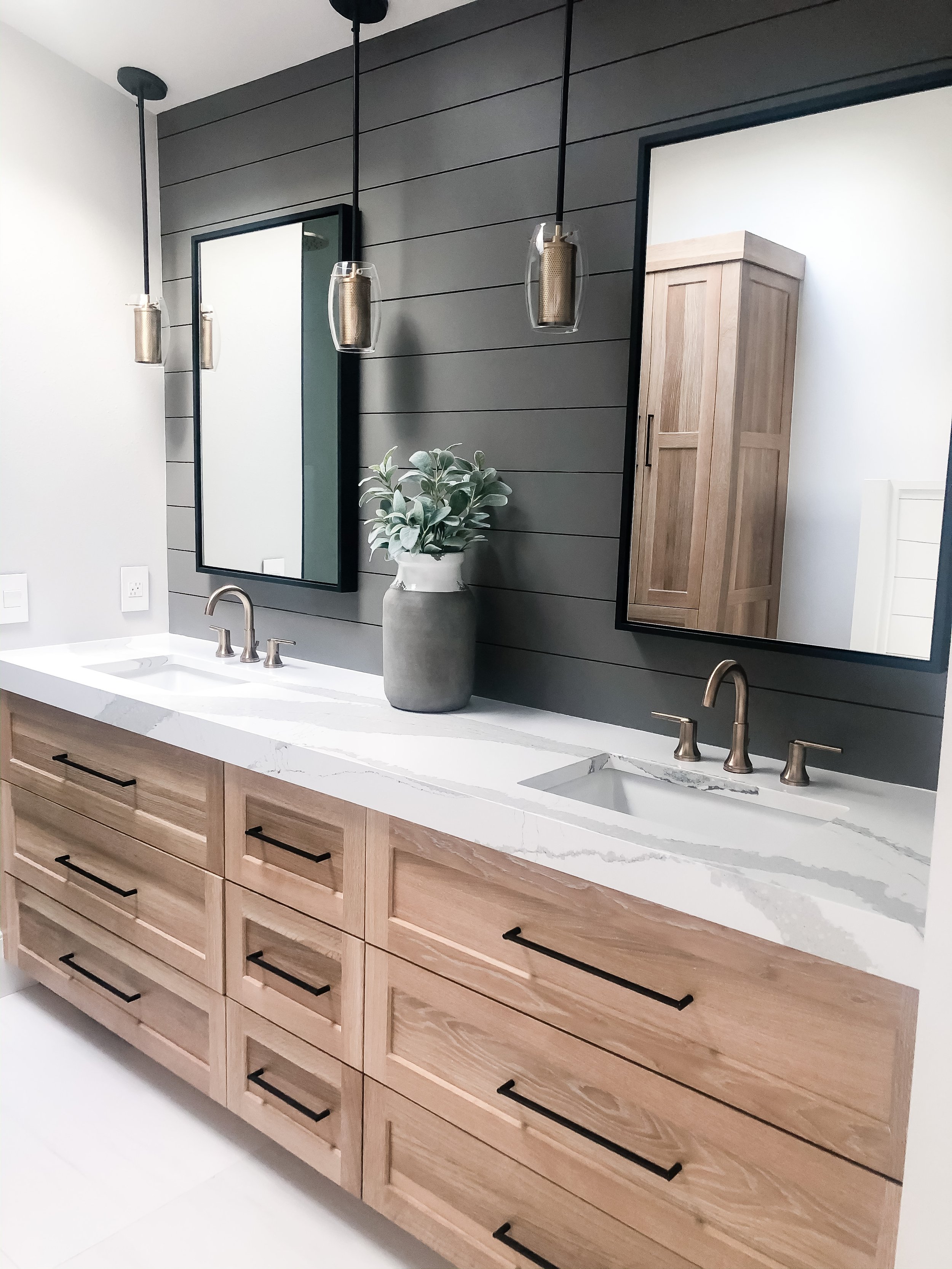
With their bathroom attached to the bedroom, we knew we need to coordinate those two spaces really well. When the homeowners gave me their inspiration and their needs and wants for the space it made the most sense to take out the window in between their vanity mirrors. With that being said, they still would have their skylight in the bathroom which really gives great natural light!
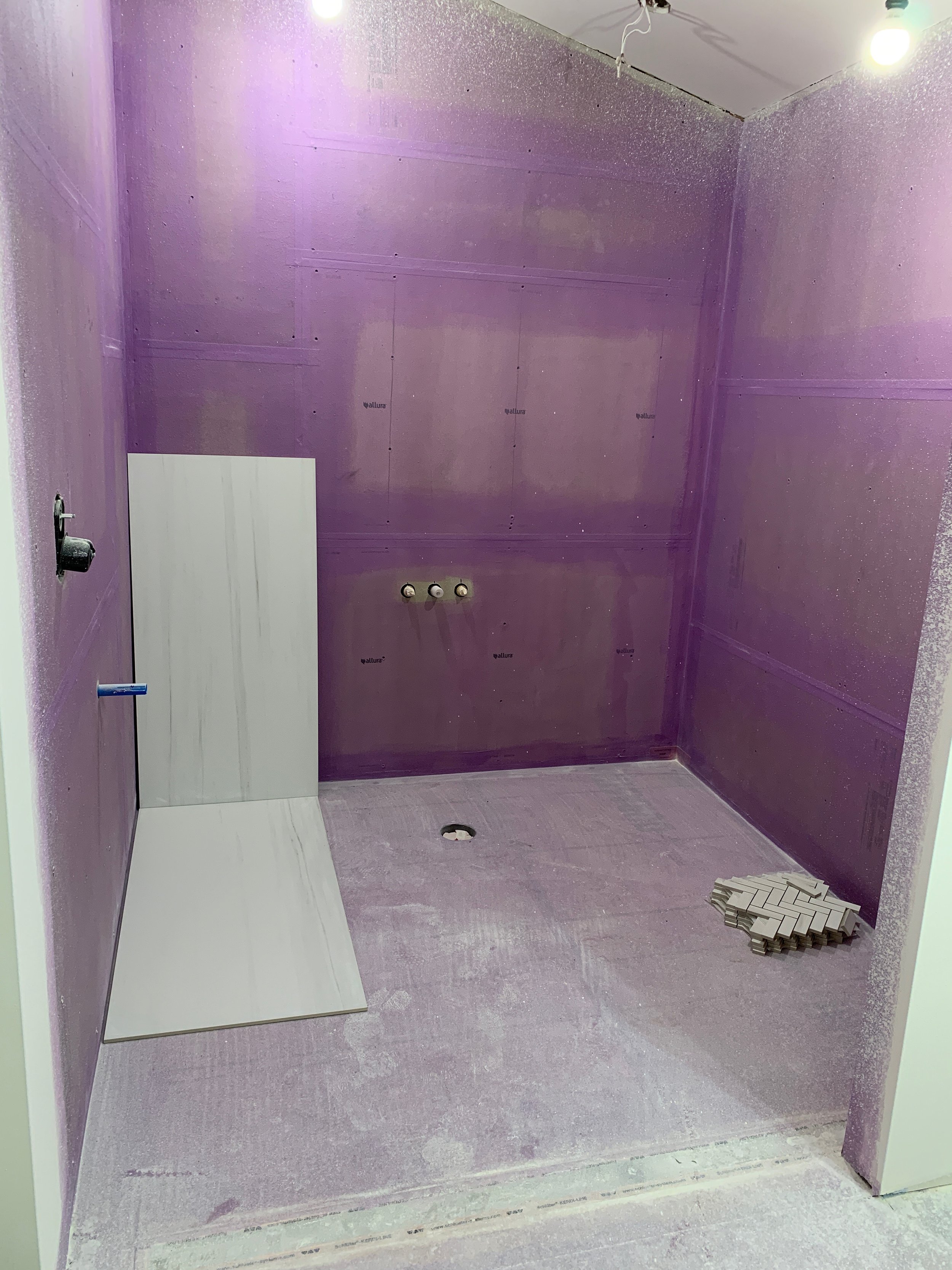
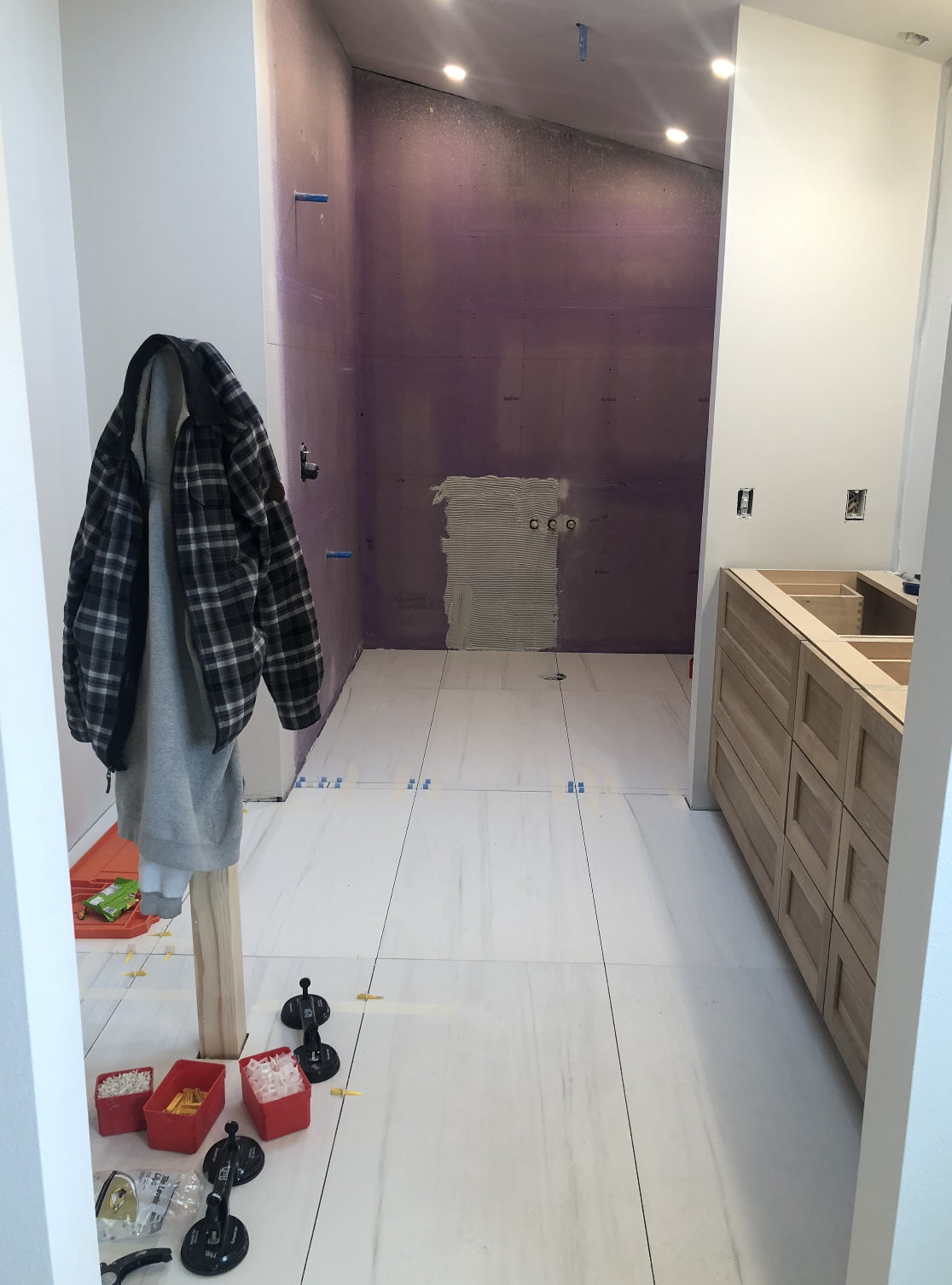
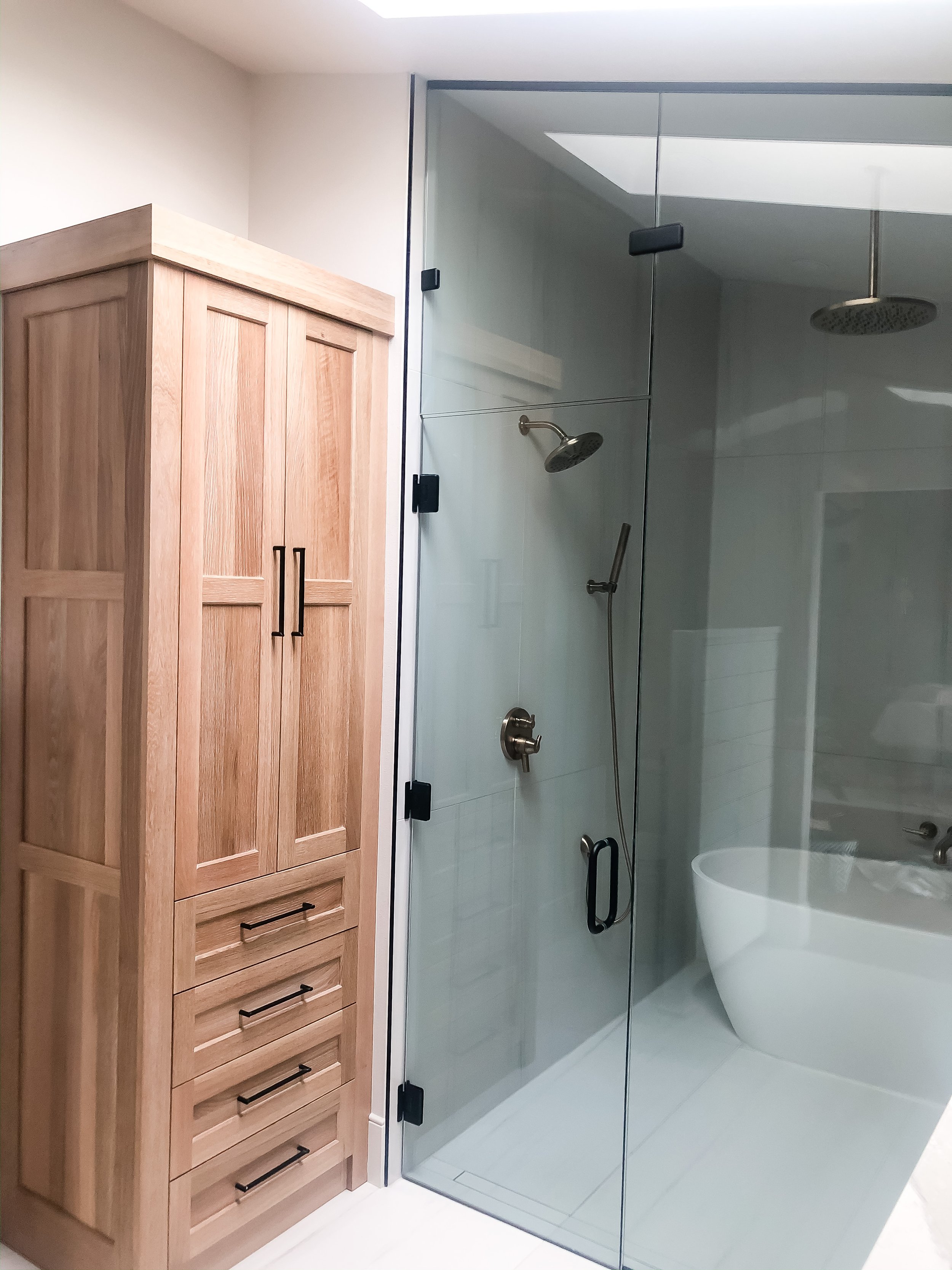
With the layout of this bathroom, we only ended up moving the toilet a couple feet. The shower was in the back, but we decided in order to make this space feel larger than it is, we added a glass wall and a glass door to the walk-in wet shower. Another detail that will make your space feel larger is larger tile. I know this sounds weird, but believe me, it does make the space feel larger even in a small room.
With the wet shower design, we decided to use the same large tiles on the walls as the floor. Thing creates such a deep and large feeling to the space. Remember when you are designing out a walk-in shower, to add more can lights than you really think. One would be fine, but two is better and more depending on the size.
I love mixing metals so adding some black and some gold in here turned out amazing. You can ALWAYS mix metals, just make sure you use both metals at least twice in the room.
Love how these spaces flow together so well! This was definitely a favorite project of mine!
